On-Ramp / Off-Ramp: Designing a clearer, more trustworthy bridge between fiat and crypto
Project overview
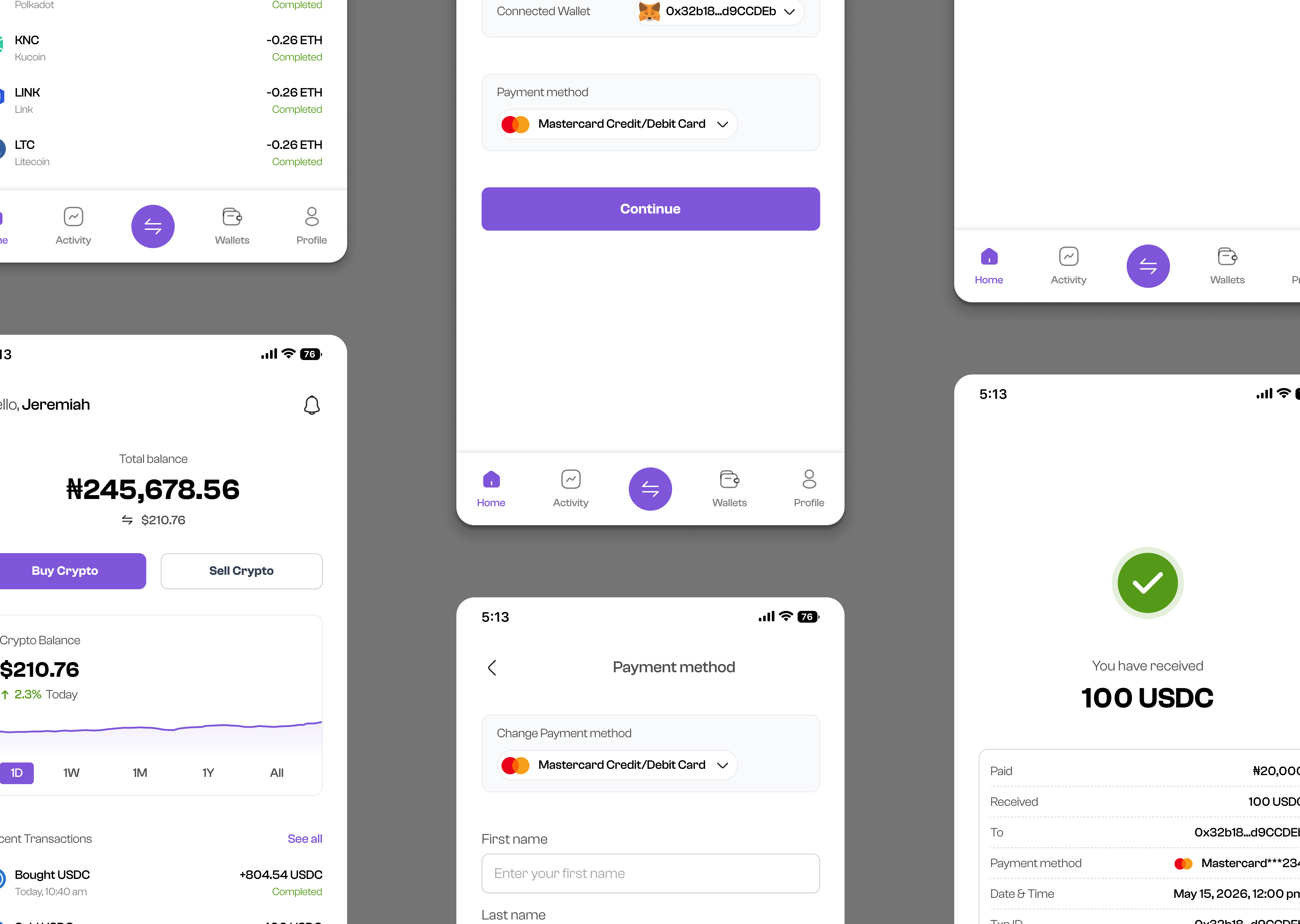
On-Ramp / Off-Ramp is a mobile-first crypto conversion experience designed to make moving between traditional money and cryptocurrency feel as straightforward as a familiar financial transaction. The product focuses on two complementary journeys:
- On-ramp: converting fiat currency into cryptocurrency.
- Off-ramp: converting cryptocurrency back into fiat currency.
The core experience was designed around a simple principle: users should always understand what they are paying, what they are receiving, where their money is going, and what happens next.
The interface supports familiar payment methods such as cards and bank transfers while presenting crypto-specific information such as wallet addresses, network fees, exchange rates, and estimated transaction times in a more approachable way.
The final concept uses a clean, minimal visual language with soft lavender surfaces, strong typography, and a vibrant purple primary action color. Rather than making the product feel overly technical or “crypto-native,” the design intentionally borrows interaction patterns from familiar fintech products.
Context & Opportunity
The Problem
Cryptocurrency products often assume that users already understand the terminology and mechanics behind blockchain transactions. For an experienced crypto user, concepts such as wallet addresses, network fees, stablecoins, transaction estimates, and exchange rates are relatively familiar. For someone who simply wants to buy or sell crypto, however, these concepts can introduce unnecessary cognitive load.
The difficulty is that traditional financial interfaces and crypto interfaces tend to treat these questions differently. Traditional fintech products have trained users to expect clear amounts, familiar payment methods, confirmation screens, and predictable transaction states. Crypto products introduce another layer of complexity because the transaction may involve a wallet, blockchain network, exchange rate, and additional network fees.
That creates an opportunity to design a bridge between the familiarity of fintech and the capabilities of crypto.
The Opportunity
The opportunity was not simply to create another crypto exchange screen. It was to simplify the conversion moment. Instead of making users navigate through a complicated trading interface, the experience could be structured around a simple mental model:
And in the opposite direction:
This gave the product a much narrower and clearer purpose.
The Design challenge
How might we make fiat-to-crypto and crypto-to-fiat conversion feel as familiar and predictable as making a conventional digital payment?
Discovery (Research & Insights)
Understanding the conversion journey
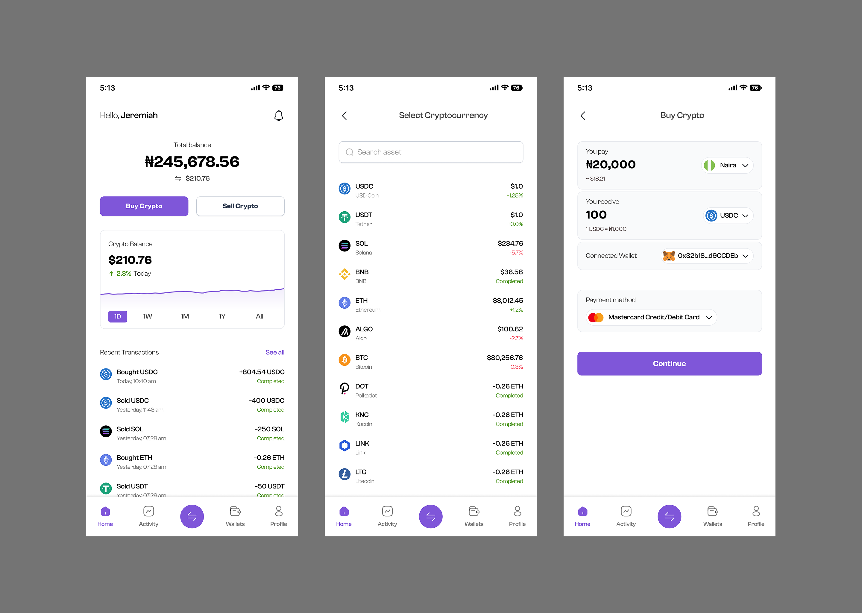
The discovery phase focused on understanding the key decisions a user has to make during an on-ramp or off-ramp transaction. Rather than treating the experience as a single form, I broke the journey into the information users need at each stage.
- Define the amount: The user enters the amount of fiat they want to spend.
- Define the asset: The user selects the cryptocurrency they want to receive.
- Understand the conversion: The interface communicates the approximate crypto amount and exchange relationship.
- Choose a payment method: The user selects how they want to fund the transaction.
- Review the transaction: The user verifies the amount, destination, payment method, estimated time, and fees.
- Confirm: The user completes the purchase.
- Select the crypto asset
- Define the amount
- Select the fiat currency
- Choose where the money should be sent
- Review the transaction
- Confirm the sale
This symmetry became important because the product contains two opposing actions, but they share many of the same interaction patterns.
Crypto transactions can feel irreversible. That makes the final review step particularly important. Instead of hiding important information behind secondary screens, the design brings the most relevant transaction details together: Amount being paid, Amount being received, Cryptocurrency, Fiat currency, Destination, Payment method, Estimated transaction time, and Network fee. The review screen therefore becomes a confidence-building step.
A major design decision was to avoid introducing unnecessary interaction patterns. The experience uses familiar concepts: Input fields, Payment cards, Account destinations, Clear conversion amounts, Review screens, and Primary confirmation buttons.
For example, the payment method screen uses a conventional card-entry pattern: First name → Last name → Card number → Expiry → CVC. Alternative payment methods are presented underneath, allowing users to interact using patterns they already understand.
The on-ramp and off-ramp journeys are fundamentally opposites.
- On-ramp: Fiat → Crypto (You pay → You receive)
- Off-ramp: Crypto → Fiat (You receive → You pay)
This creates a consistent mental model and reduces the amount of new information users need to learn when switching between the two flows.
A crypto product can expose a lot of information without necessarily making the transaction clearer. The design therefore separates essential information from supporting information to keep the transaction contextually clear.
This became the foundation for the MVP.
MVP Rationale
Crypto products can quickly become feature-heavy. A mature platform could eventually contain: Trading, Swapping, Portfolio management, Staking, Wallet management, Recurring purchases, Price alerts, Market analytics, Transaction history, Multiple networks, and Multiple assets.
But none of those features are necessary to validate the fundamental proposition: Can a user move between fiat and crypto with confidence? For the MVP, I focused on the smallest experience capable of answering that question.
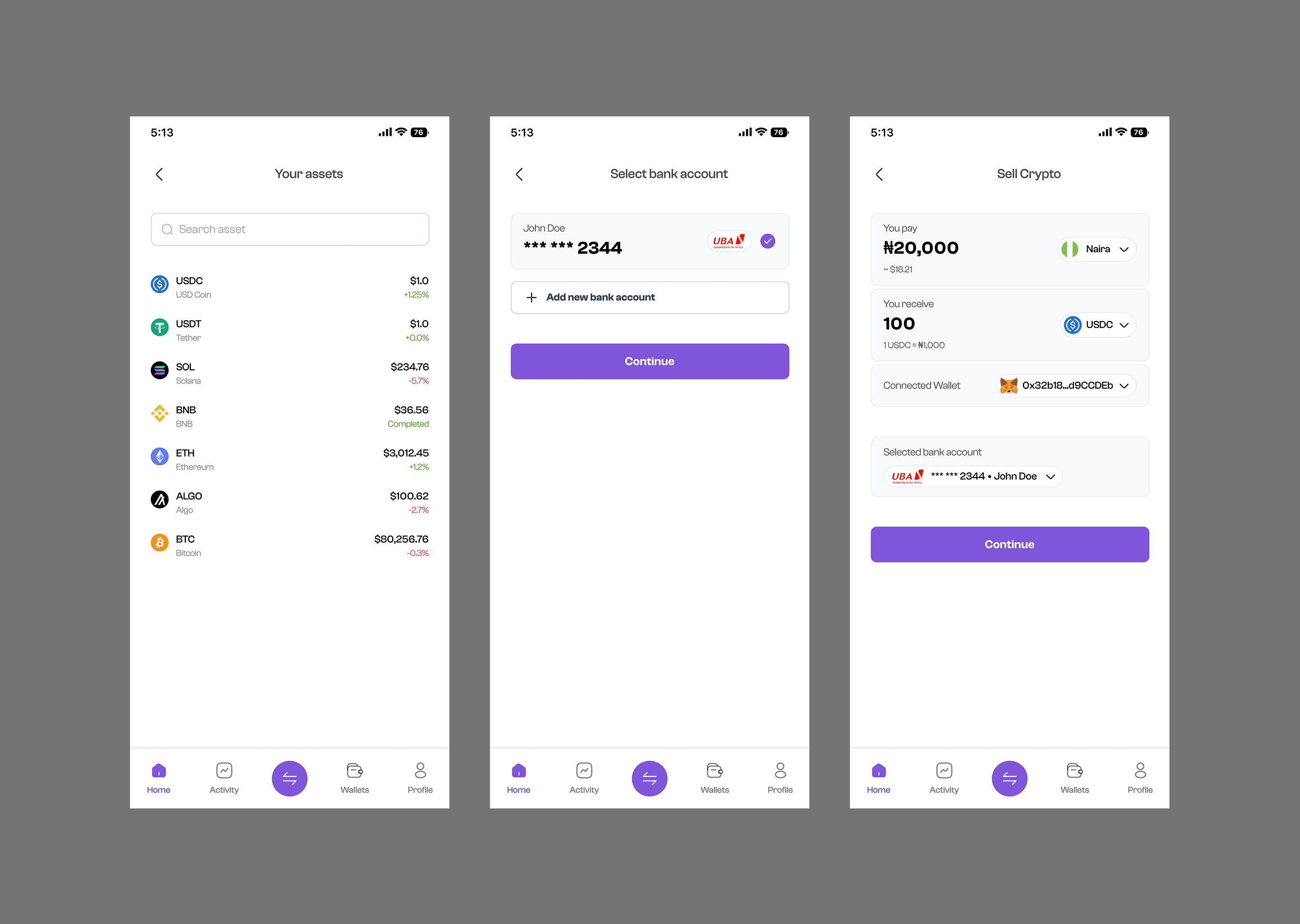
The MVP focuses on two core jobs
The user should be able to:
- Select a fiat currency.
- Enter an amount.
- Select a crypto asset.
- View the expected amount.
- Select a payment method.
- Review the transaction.
- Confirm the purchase.
The user should be able to:
- Select a crypto asset.
- Enter an amount.
- Select a fiat currency.
- Select a payout destination.
- Review the transaction.
- Confirm the sale.
This gives the MVP a very clear value proposition without requiring an extensive product ecosystem.
Design Principles & Thought-Process
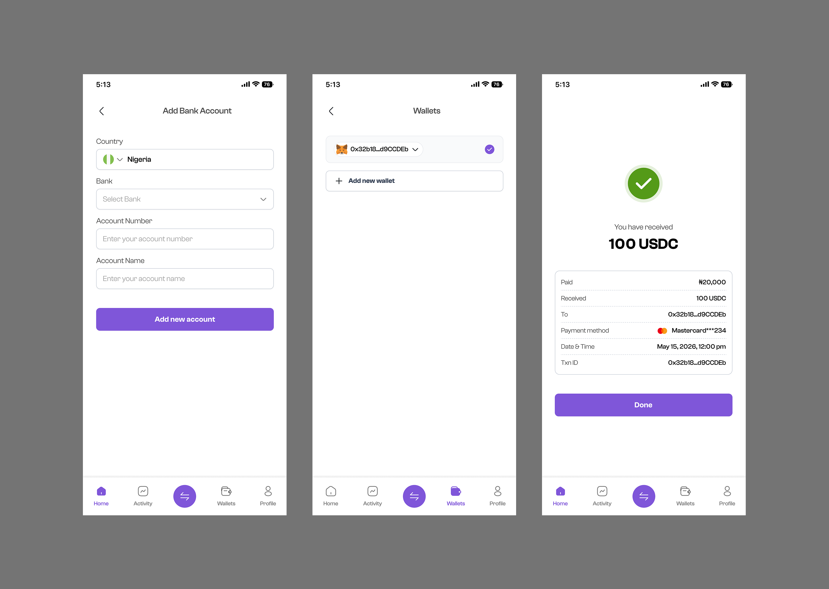
The primary purpose of the interface is not to educate users about blockchain. It is to help them complete a transaction. Therefore, the UI gives the transaction itself the most visual attention. The most important elements are immediately visible: Amount → Currency → Amount received. This allows the user to understand the transaction before interacting with secondary controls.
Crypto terminology can be intimidating. Instead of relying heavily on technical language, the interface uses simple labels such as: You pay, You receive, Payment Method, Destination, Estimated time, Network fee. These labels describe what the user needs to know without requiring extensive blockchain knowledge. The goal was to translate technical information into understandable context.
Not every piece of information needs to compete for attention simultaneously. The design introduces information progressively: How much are you paying? What are you receiving? How are you paying? Where is the crypto going? What will the transaction cost? Confirm. This sequence follows the user's natural decision-making process.
A primary CTA such as Buy USDC or Sell USDC represents a meaningful action. The user should not reach that button wondering what will happen next. The confirmation screen therefore functions as a final checkpoint. Only after seeing this information does the user encounter the final action. The design intentionally makes the confirmation button feel like the conclusion of an understood process.
Key Decisions & Trade-offs
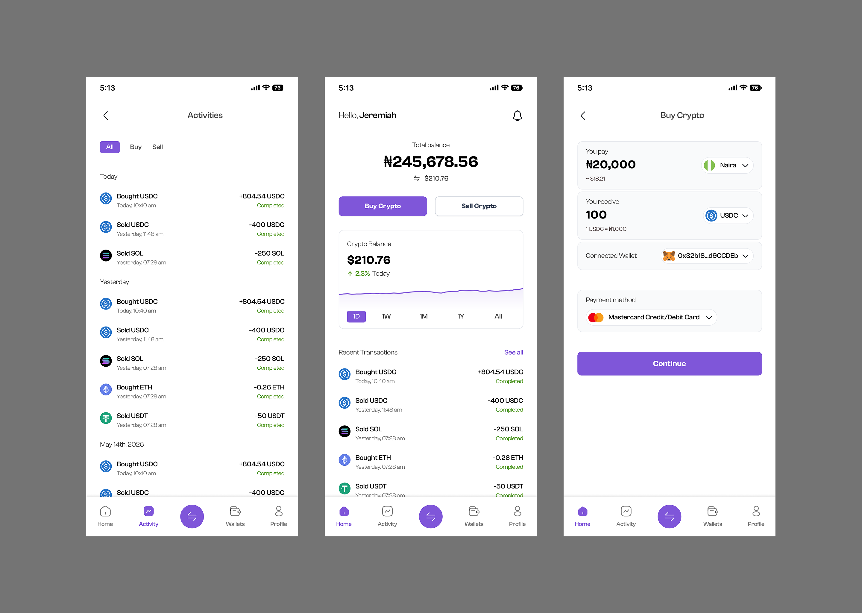
1. Use a focused transaction flow instead of a dashboard-heavy experience
One temptation with financial products is to begin with a dashboard showcasing balances, charts, and asset lists. For this MVP, that would distract from the primary task. The design prioritizes the conversion journey itself.
Trade-off: A dashboard could make the product feel more like a complete crypto platform, but it would introduce additional complexity without helping validate the core conversion experience. I chose task completion over feature density.
2. Use large conversion fields
The amount fields are visually prominent because the conversion itself is the central interaction. The structure: 12,000 Naira ↓ 806.45 USDC is much easier to scan than presenting information inside a dense table or trading interface.
Trade-off: Large fields consume more vertical space, but that space is justified because the amount relationship is the most important information in the transaction.
3. Separate payment selection from transaction review
The payment method screen handles the complexity of entering credentials. The review screen then summarizes the selected method: Configure → Review → Confirm.
Trade-off: This introduces an additional screen compared with a single long form. However, combining everything into one screen would increase visual density. The additional step is used to improve comprehension.
4. Show fees before confirmation
Fees can be frustrating when they appear unexpectedly. The transaction review surfaces the network fee before the user commits to build a transparent experience.
Trade-off: Showing fees earlier can make the interface feel slightly more information-heavy. But hiding the fee would create a more serious trust problem. Transparency was prioritized over visual simplicity.
5. Keep the visual language closer to fintech than traditional crypto
The product uses white backgrounds, soft lavender surfaces, rounded containers, strong black typography, purple primary actions, restrained iconography, and familiar payment patterns. The visual direction communicates: “This is a financial product you can understand.”
What I Learned
- 1. Simplicity is not the same as removing information: Simplifying a financial product does not mean hiding complexity. Good financial UX is less about reducing information and more about reducing uncertainty.
- 2. Confirmation screens are part of the experience, not an afterthought: The final review screen answers last-minute questions (“Is this the correct amount?”, “What is the fee?”), making confirmation a critical trust-building moment.
- 3. Familiarity can make emerging technology feel accessible: By adapting crypto transactions to patterns users already recognize (cards, payments, amounts, receipts), the technology becomes approachable.
- 4. Consistency becomes even more valuable when flows are symmetrical: On-ramp and off-ramp are mirror experiences. Reusing visual hierarchy and structures across both flows reduces design complexity and improves scaling.
- 5. Trust is a UX feature: In financial products, trust comes from predictable behavior and transparent information. The interface should never make users feel like they are clicking a button and hoping for the best.
Closing Thoughts
On-Ramp / Off-Ramp started as a relatively simple problem: How do we make it easier to move between fiat and crypto? But designing the experience revealed that the deeper problem is not conversion itself. It is confidence.
Users need confidence that they understand the transaction, that their money is going to the right place, that the amount they see is what they can expect, and they need confidence before they press the final button.
The result is a focused mobile-first conversion flow that connects traditional finance and cryptocurrency through a simple interaction model: Choose what you pay. Choose what you receive. Choose how it moves. Review everything. Then confirm.
For me, the most valuable takeaway from the project is that good fintech UX isn't necessarily about making complex systems disappear—it is about making their complexity understandable at the exact moment users need to make a decision. And that is the role I wanted this design to play: a simple, transparent bridge between fiat and crypto.