LMS Learner Dashboard: Direction Over Distraction
Project overview
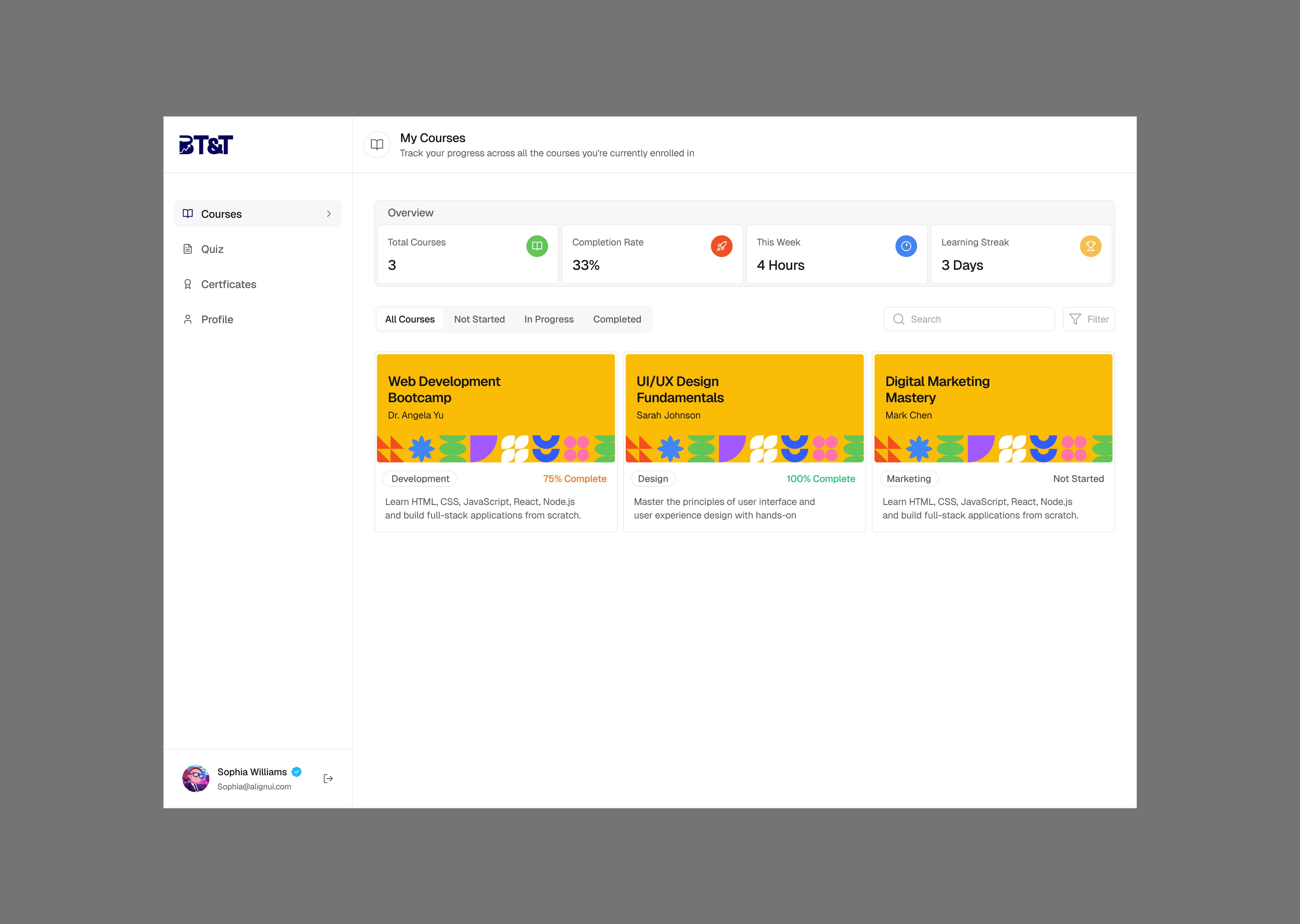
The Learner Dashboard was designed as the central workspace for an online learning platform, bringing together everything a learner needs to manage their courses, monitor progress, complete assessments, and access their achievements. Rather than treating the dashboard as a collection of screens, the project focused on designing a connected experience around a simple question: “What does the learner need to know, and what should they do next?” The result is a dashboard experience designed around clarity, progress, and momentum — helping learners move from logging in to taking meaningful action with as little friction as possible.
Context & Opportunity
The Context
The LMS was being designed to support a complete digital learning journey, from discovering and enrolling in a course to completing lessons, taking assessments, and earning a certificate. The wider product included: Course discovery and browsing, Course detail and enrollment, Learner authentication, Course learning experiences, Module-based learning, Assessments and quizzes, Progress tracking, Certificates, Payments and billing, and Learner settings and profile management.
Within that ecosystem, the dashboard became particularly important because it serves as the learner's home base after authentication.
A learner shouldn't have to navigate through multiple pages just to understand:
- What courses am I taking?
- How far have I progressed?
- What lesson should I continue?
- Do I have an assessment to complete?
- Have I earned a certificate?
- What have I already accomplished?
The dashboard needed to answer these questions quickly.
The Opportunity
The opportunity was to create a learner experience that felt less like an administrative LMS and more like a personal learning workspace. The design needed to balance two competing needs:
Learners need visibility into: Courses, Progress, Assessments, Certificates, Activity, and Learning status.
At the same time, the interface shouldn't overwhelm users with information. The learner should be able to quickly identify the most important next step:
This led to the central design direction: turn the dashboard from an information center into a learning companion.
Discovery (Research & Insights)
The discovery phase was driven primarily by the product requirements, defined learner flows, and the underlying LMS data model. Instead of designing screens in isolation, I mapped the dashboard against the actual learner lifecycle and the information the platform needed to support.
Understanding the Learner Journey
The core learner journey can be simplified into:
The dashboard sits in the middle of almost every stage after enrollment. That meant the dashboard had to support different learner states rather than presenting the same experience to everyone.
A learner who has just created an account or enrolled in their first course needs orientation: Where their course is, How to get started, What the platform offers, and What their next action is.
A returning learner already understands the platform. Their primary need is speed: Resume their course, Find their current lesson, Check progress, Complete an assessment, and See what remains.
A learner approaching completion has different priorities: Remaining lessons, Module completion, Assessment results, Final assessment, and Certificate eligibility.
This distinction influenced the dashboard architecture significantly.
Designing Around the Data Model
The updated LMS schema introduced several important concepts that shaped the experience. A course contains:
Lessons can be Video, Text, or Quiz. Learners also have Enrollment status, Lesson progress, Module quiz completion, Final assessment completion, Certificates, and Activity history.
Core UX Insight: Course progress isn't a single number. It is the result of several connected learning activities.
For example, a learner could have completed 8 of 12 lessons, passed 2 module quizzes, started a third module, and not yet completed the final assessment. A simple "75% complete" indicator doesn't tell the entire story. The dashboard therefore needed to expose progress at the right level of detail without overwhelming the learner.
Key Insights
Showing that a learner has completed 60% of a course is useful, but telling them what to do next is more actionable. This is why Continue Learning / Resume Course became a high-priority interaction.
Progress indicators shouldn't exist simply as decoration. They should answer: “How much have I completed, and what remains?” This informed the use of progress bars, completion states, module indicators, and assessment statuses.
A new learner needs guidance. A returning learner needs efficiency. This meant the dashboard architecture needed to support both without creating two completely separate products.
Certificates shouldn't appear as an isolated feature. They represent the end of a sequence: Learning → Assessment → Completion → Certificate. The dashboard treats certificates and assessments as part of the overall learning journey.
The underlying schema introduced statuses such as NotStarted, InProgress, and Completed. These states became important UX states rather than merely backend values. A course that hasn't been started should not look the same as one that is 70% complete.
MVP Rationale
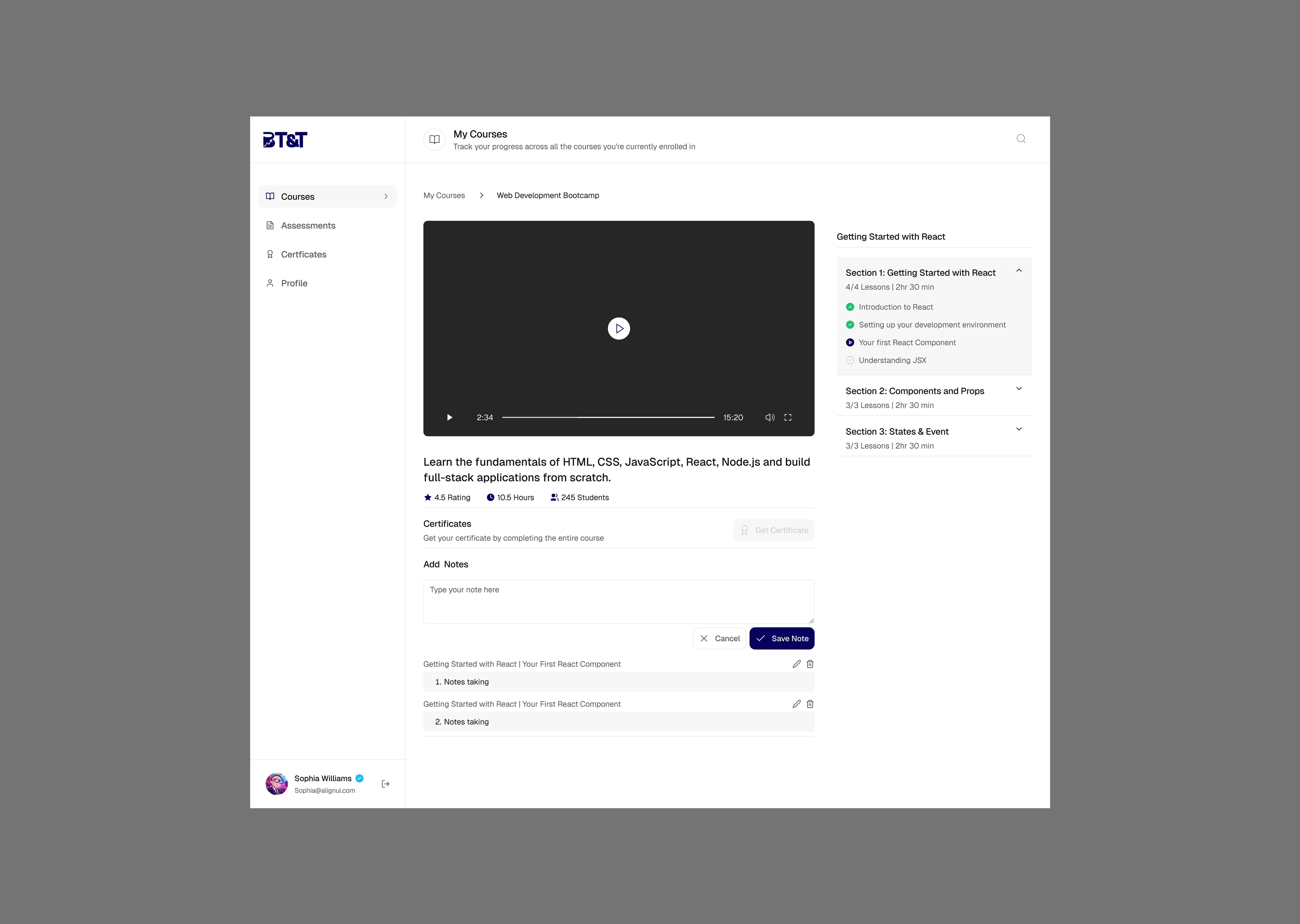
Defining the Dashboard MVP. The goal wasn't to build every possible LMS feature into the dashboard. The MVP focused on the experiences that directly support learning progression. The core dashboard ecosystem was structured around:
Additional areas such as Payments & Billing and Profile Settings support the learner's account but aren't the primary learning loop.
The Core Learning Loop
- Discover current learning: The learner sees the courses they're enrolled in.
- Continue learning: The learner can immediately resume their current course.
- Track progress: The learner can understand how far they've progressed.
- Complete assessments: Module quizzes and final assessments provide checkpoints for understanding.
- Complete the course: Course completion represents the culmination of the learning journey.
- Earn a certificate: Once eligible, the learner can access their certificate.
This loop informed the hierarchy of the dashboard.
Why These Features Made the MVP
- Dashboard Overview: Provides a snapshot of the learner's current state.
- My Courses: Provides a dedicated destination for enrolled courses.
- Progress Tracker: Makes learning progress visible and measurable.
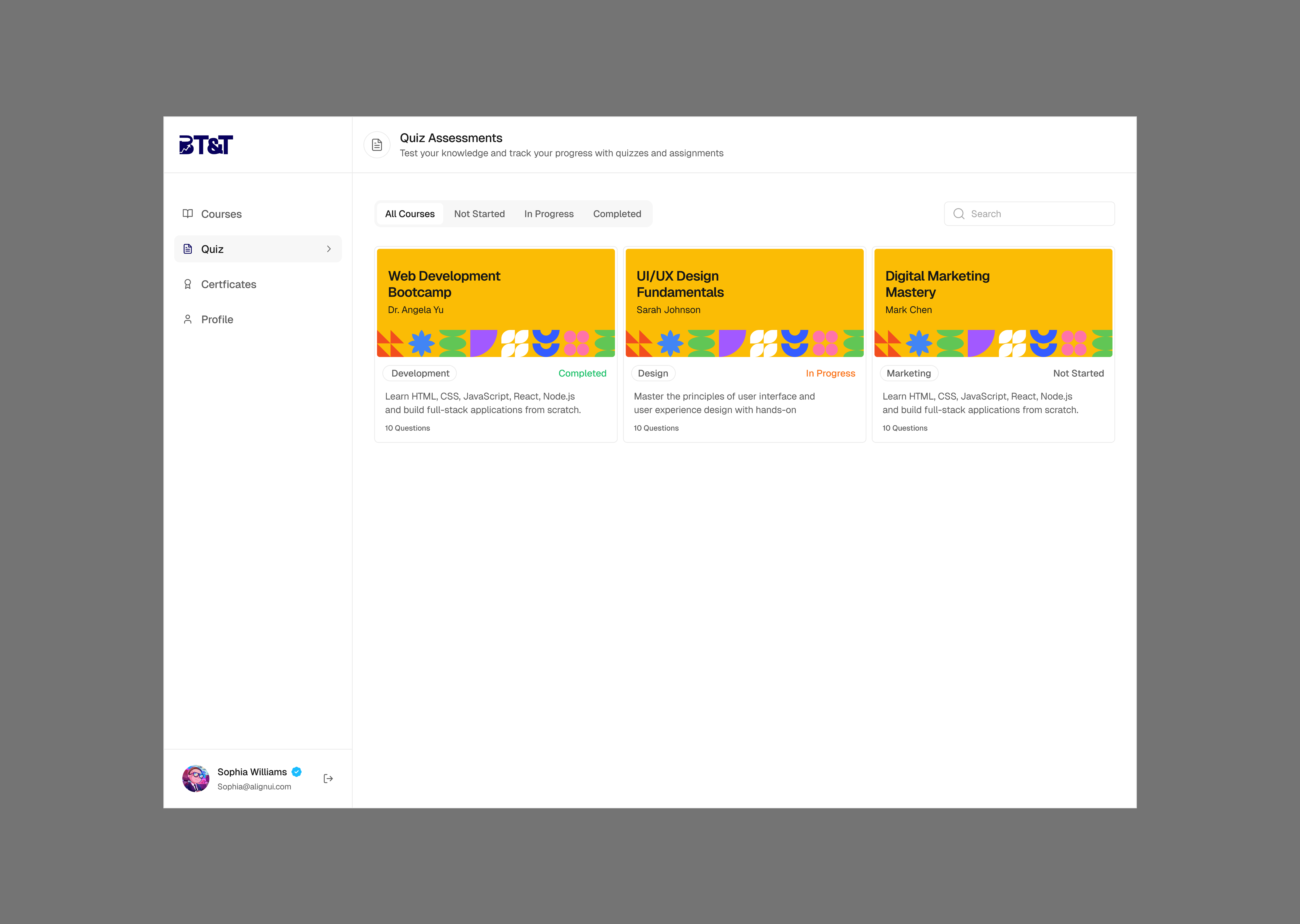
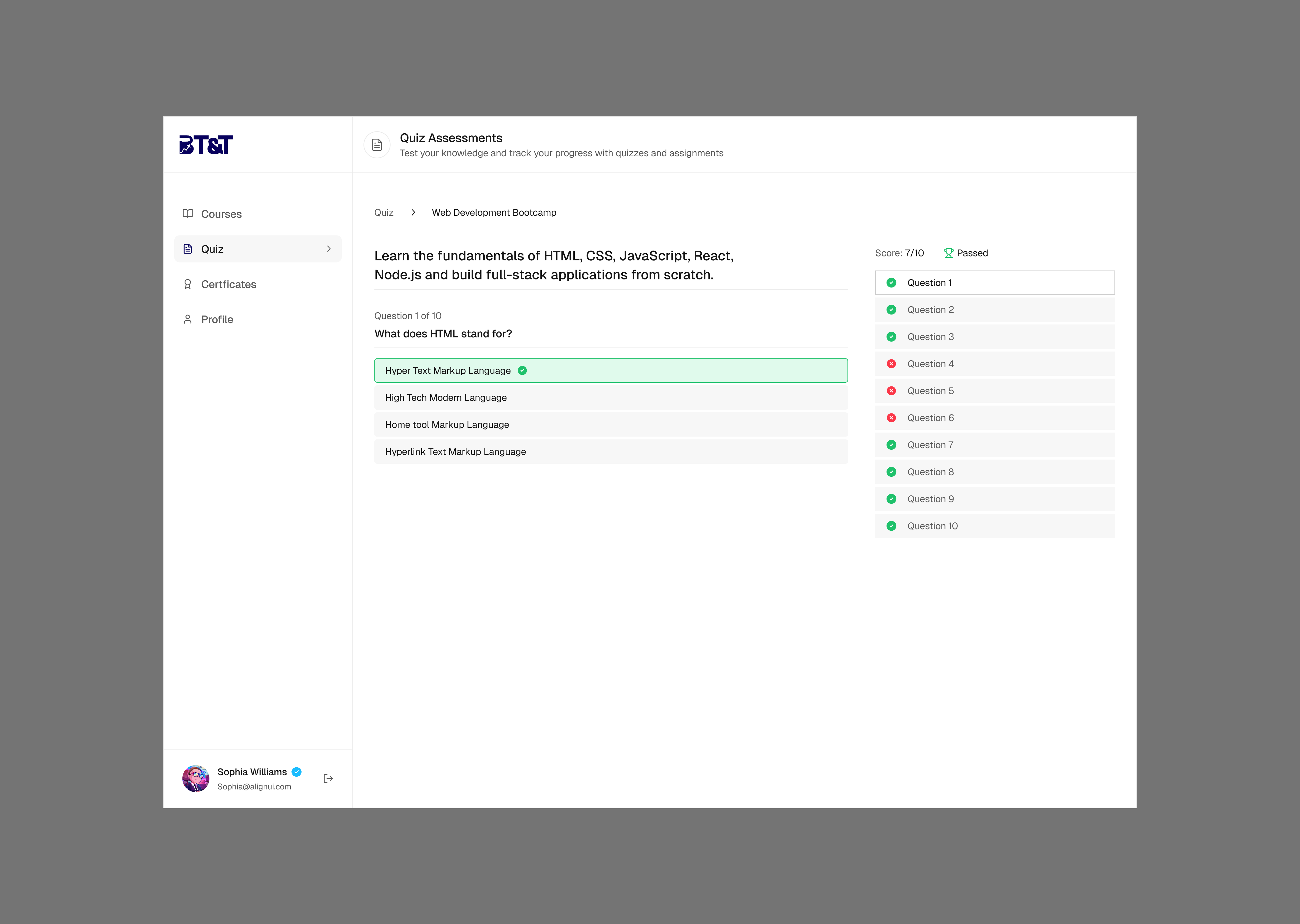
- Assessments: Creates a clear destination for quizzes and results.
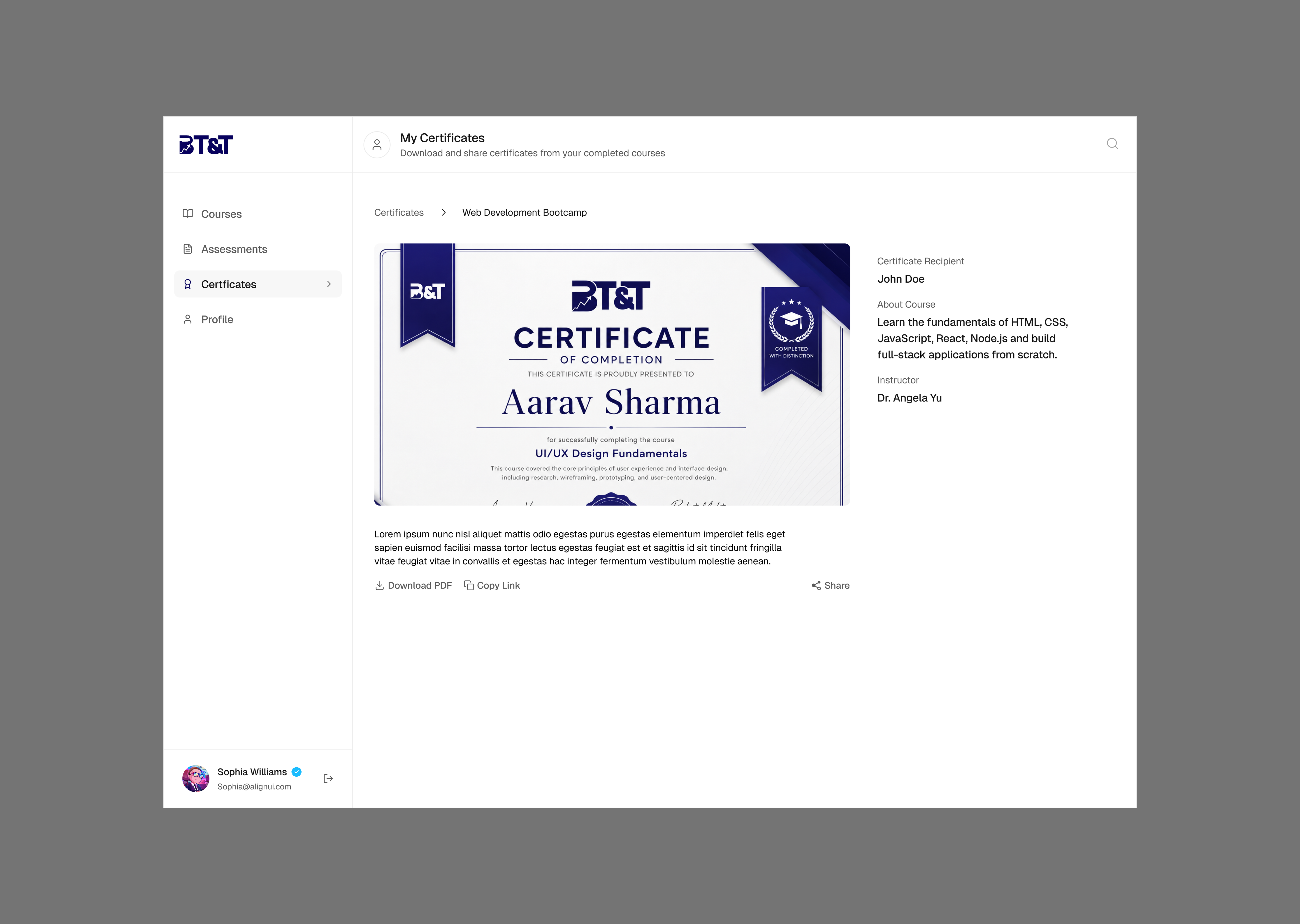
- Certificates: Provides tangible recognition of completed learning.
These features create a complete enough loop for a learner to enter the platform, learn, measure progress, complete requirements, and reach an outcome.
Design Principles & Thought-Process
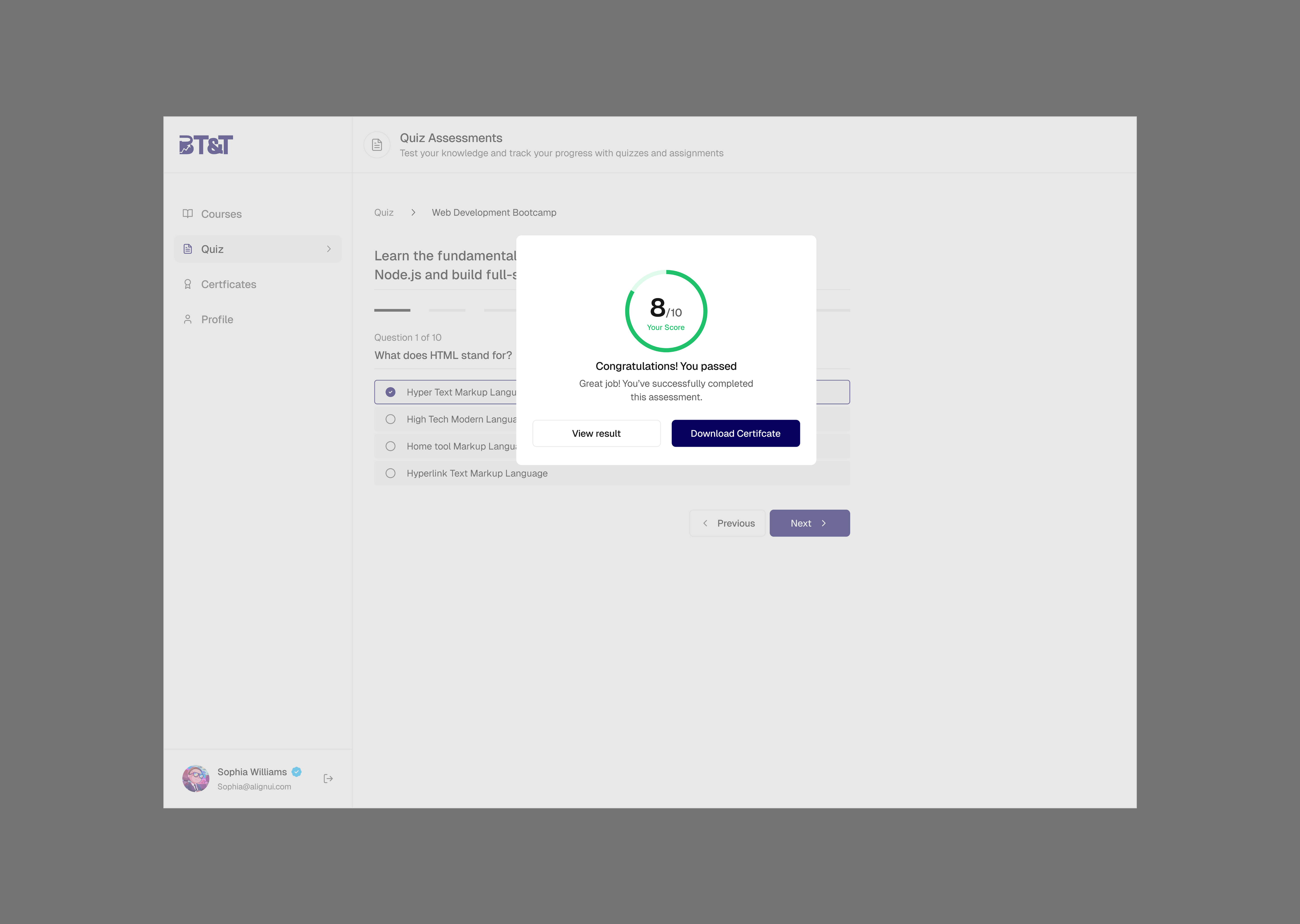
An LMS can quickly become information-heavy. Courses have modules, modules have lessons, lessons can have quizzes, courses have assessments, assessments have results, and completed courses generate certificates. The interface needed to simplify this complexity. Instead of presenting every piece of information at once, the design establishes a hierarchy: What should I do now? How am I progressing? What have I accomplished?
The dashboard shouldn't make learners think: “Where do I go from here?” The primary action should be visually obvious. For an active learner: Continue Course. For a learner with an outstanding assessment: Take Assessment. For a completed course: View Certificate. This approach makes the interface responsive to learner state.
Progress was treated as more than a data point. Visual progress gives learners evidence that their effort is producing results. The interface uses progress indicators, completion states, course status, assessment results, and certificates to create a sense of forward movement.
The dashboard contains a lot of potentially useful information. The challenge was deciding what not to show. Rather than presenting every metric, the interface prioritizes the information most relevant to the learner's immediate goal. Secondary information remains accessible through dedicated sections.
The dashboard was designed as part of a broader LMS rather than a standalone page. This meant creating consistency across navigation, cards, buttons, progress indicators, status labels, course representations, assessment states, and empty states. Consistency allows learners to understand new screens using patterns they've already encountered.
One of the biggest considerations was the difference between static UI and a real learning product. The same course can exist in different states: Not Started → In Progress → Completed. Similarly, an assessment can be Available → In Progress → Passed / Failed. And a certificate can be Unavailable → Eligible → Issued. The UI communicates state clearly so the dashboard feels responsive to the learner rather than static.
Key Decisions & Trade-offs
Decision 01 — Prioritize “Continue Learning”
One of the most important decisions was to give active learning a prominent position on the dashboard. For returning learners, the most valuable action is usually not browsing — it's continuing where they left off.
Trade-off: Giving this action more prominence means other information receives less visual emphasis. That was intentional. The dashboard prioritizes action over information density.
Decision 02 — Separate “My Courses” From the Overview
The dashboard provides an overview, while My Courses provides a deeper course-management experience. Trying to show every enrolled course and every detail on the homepage would create unnecessary complexity.
Trade-off: The learner needs one additional navigation step to see the full course library. In return, the dashboard remains focused and easier to scan.
Decision 03 — Dedicated Progress Experience
Progress could have been represented entirely through dashboard cards. Instead, a dedicated Progress Tracker was introduced. Learners who want a deeper understanding of performance need room for course-level progress, module completion, lesson completion, assessment performance, and activity logs.
Trade-off: This adds another destination to the navigation. However, it prevents the dashboard homepage from becoming overloaded.
Decision 04 — Treat Assessments as a First-Class Experience
The updated product structure supports both module quizzes and final course assessments. This meant assessments couldn't simply be buried inside individual lessons — they needed a dedicated destination.
Trade-off: More navigation complexity versus better discoverability. For an LMS, assessment visibility is important enough to justify the additional destination.
Decision 05 — Certificates as an Achievement
Certificates were treated as more than downloadable documents. They represent a significant milestone in the learner's journey, connecting naturally from Course completion → Assessment completion → Certificate to give learners a visible outcome to work toward.
What I Learned
- A dashboard is an orchestration problem: Dashboard design isn't primarily about arranging cards. It's about deciding what information deserves attention at what moment around the user's current context.
- Data models influence UX more than expected: Working alongside the LMS schema (enrollment status, lesson progress, quiz completion, certificate tracking) helped design an experience that realistically supports the product backend.
- Designing states is as important as designing the happy path: Real learners experience empty states, in-progress courses, completed courses, failed assessments, and unavailable certificates. Designing these states early makes the experience robust.
- Simplicity requires difficult decisions: It is easy to keep adding information because almost everything feels useful. The hard part is deciding what doesn't need to be there.
Closing Thoughts
The Learner Dashboard was ultimately an exercise in turning a complex learning system into a simple, understandable experience. Behind the interface are courses, modules, lessons, quizzes, assessments, progress records, activity logs, and certificates. The learner shouldn't need to understand that complexity. They simply need to know: Where am I? What have I completed? What should I do next? What am I working toward?
That became the foundation of the dashboard experience. The final designs aim to make learning feel structured without feeling complicated — giving learners enough visibility to stay motivated while keeping the path forward clear.
More than a dashboard, the goal was to create a visual roadmap for the learner's journey. And that is the principle I would carry forward as the platform evolves: every screen should make the next step clearer, not harder.